Showing posts with label infographics. Show all posts

Monday, 31 May 2010

GDS Digital

GDS Digital is a company that specialises in making info graphics for websites and articles. Below is some of their work I believe is a good example of data visualisation.

The World's Leading Companies


This graphic was created for Business Management and looks at the top companies in the world on the the Forbes Global 2000 list and breaks them down into industry and sectors, looking at how much money is made in which fields.


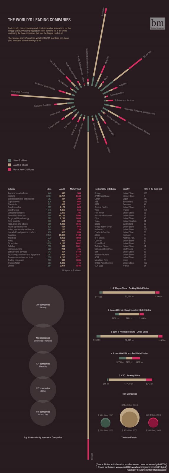
The large yellow line down the graphic isn't there as a margin between the 2 columns but actually part of  the diagram at the top for the banking sector, demonstrating the grip the financial sector has on the world. This can be seen online along with it's accompanying article on Business Week: http://www.busmanagement.com/news/the-worlds-leading-companies/

Gulf of Mexico Oil Spill


The Evolution of Privacy on Facebook

For the Imbalance brief I have been looking at data graphics. Below are a set done by Matt McKeon, a developer working with the Visual Communication Lab at IBM Research. They document the how Facebook's privacy policies have changed over the years and how newer default settings grant access to different data sets on your profile:


A scary thought indeed to see how your data has spread through the years, however a nice example of data visulisation. Simple, effective, clean.

An interactive version of this can be seen on McKeon's website: http://mattmckeon.com/facebook-privacy/